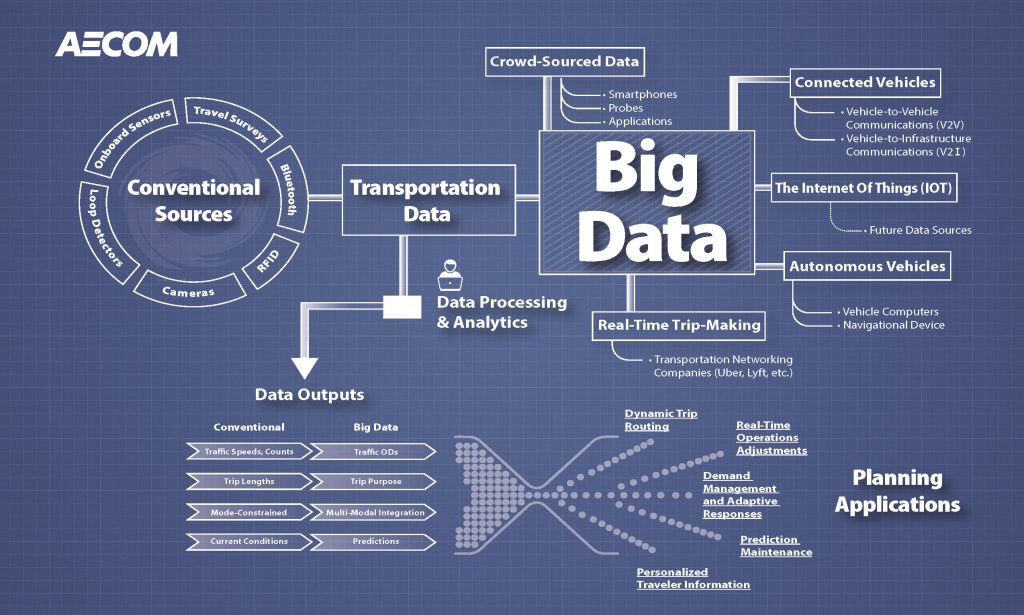
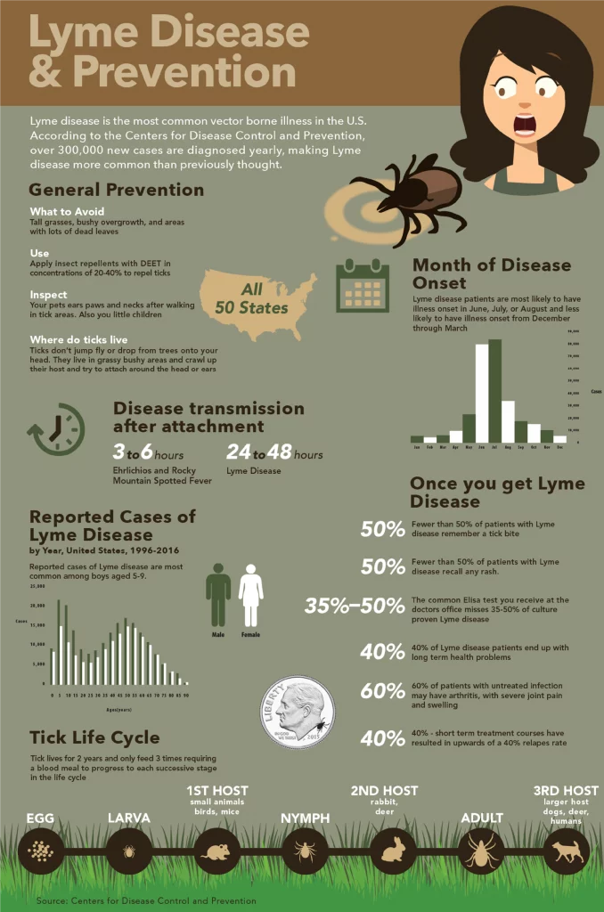
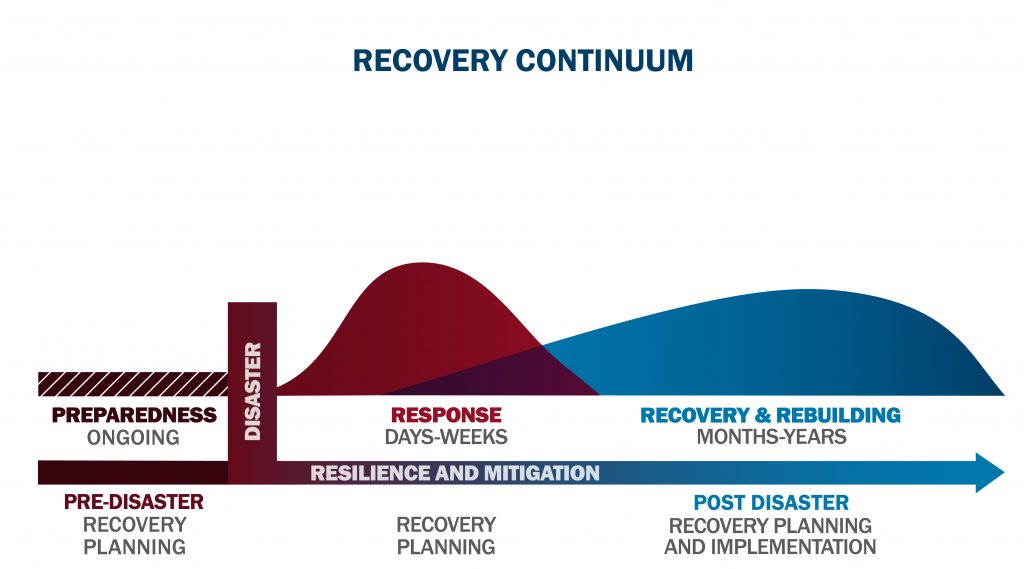
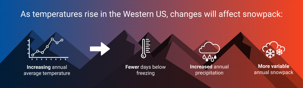
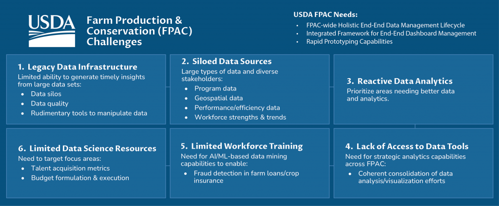
Context
These graphics were created for projects where the audience needed to understand a process, system, risk, timeline, or set of related ideas quickly. The work often involved translating dense source material into a visual format that could support reports, presentations, proposals, and public-facing communication.
What This Shows
This work shows information design, visual hierarchy, diagram thinking, icon use, layout control, and the ability to turn complex material into clear visual communication. It also shows range across styles, from polished federal presentation graphics to more illustrative public-information pieces.
Connection to Current Work
This connects directly to my current work in web systems, structured content, and AI-assisted workflows. The same skill is at the center of my current practice: take complicated information, organize it into a clear structure, and create a visual system that helps people understand what matters.
Gallery